In personal injury litigation, the truth is not just in the details. It lies in how those details come together. Attorneys face a daily challenge: translating thousands of medical records into a clear, persuasive case. While expert testimony and narrative summaries carry weight, one of the most powerful but often underused tools is the comparison chart. A visual representation of change, progress, or deviation can do what words alone often cannot. At Trivent Legal, we do more than summarize records. We clarify patterns, expose inconsistencies, and bring clarity to complexity. Comparison charts are one of the most effective ways to transform data into courtroom impact.
Why Visual Comparison Matters
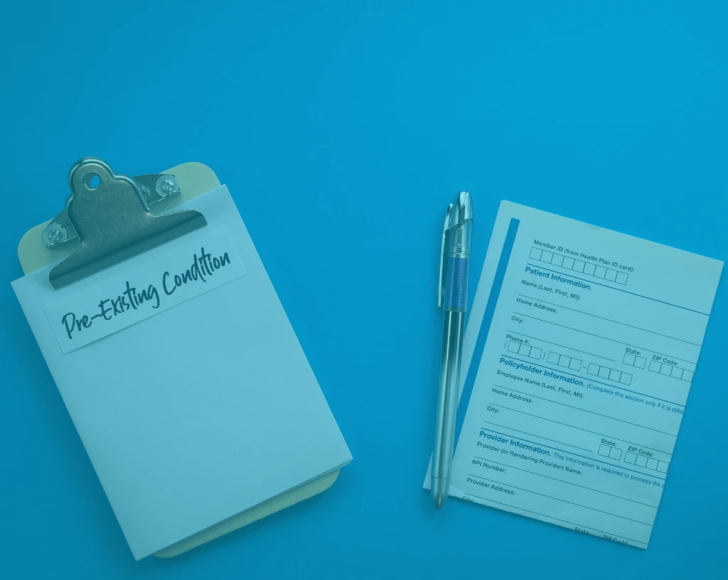
Medical records are dense. They are filled with physician notes, lab values, treatment logs, and diagnostic codes. Within them lies the entire story of your client’s injury, care, and recovery. The challenge is to make that story more visible.
Visual comparison charts simplify this complexity. They give attorneys and legal teams a way to track what changed, when it changed, and why that change matters. And more importantly, they make it possible for judges, juries, and adjusters to grasp those same insights quickly.
A well-constructed comparison chart is not just graphics. It is a strategic asset.
Practical Applications in Personal Injury Litigation
Identifying Medical Changes Over Time
Comparison charts highlight what changed between the pre-injury and post- injury periods. This includes:
- Newly developed conditions following the incident
- Worsening of pre-existing conditions
- Loss of function or mobility
- Additional treatments or medications required
This makes it easier to demonstrate how the incident directly affected the client’s health status.
Establishing Causation with Precision
In personal injury law, causation is essential. You must show that a specific event caused specific harm.
A visual chart that compares medical baselines before and after the incident builds a persuasive bridge between the incident and the injury. It strengthens expert opinions and reduces the chance that the defense will successfully argue for alternate causes.
Tracking Recovery and Setbacks
Recovery is rarely linear. A well-designed comparison chart can highlight:
- Progress made through therapy or rehabilitation
- Complications or setbacks during recovery
- Missed or delayed treatments
- Gaps in care that may signal negligence
These details support both the narrative of suffering and the need for continued care.
Turning Data into Strategy
At Trivent Legal, we approach visual comparison as a form of expert storytelling. Every chart we build is anchored in verified records and designed with legal strategy in mind.
Here is how we make it work:
- Label each data point clearly: From diagnosis to medication to symptom progression
- Keep the visuals clean and focused: Simplicity does not mean lack of depth
- Use timelines to map causality and recovery
- Link every chart to the source document for easy reference
- Include MD commentary to support conclusions
The result is a visual asset that does not just illustrate but persuades.
Where Visuals Drive Value
Negotiation and Mediation
Comparison charts help quantify:
- Pain and suffering
- Loss of mobility or function
- Need for ongoing care
- Financial burden of medical treatment
This provides a solid foundation for settlement discussions and strengthens your position in mediation.
Disputing Comparative Negligence
In cases where responsibility may be shared among multiple parties, comparison visuals help untangle the timeline of decisions, treatments, and missed steps. This supports arguments around liability and apportionment of faults.
Demonstrating Deviation from Clinical Standards
Charts can compare actual treatments received with recognized clinical guidelines. If a provider fails to follow standard protocols, the deviation becomes immediately visible. That is a powerful tool in medical malpractice and negligence claims.
Enhancing Understanding Across the Board
The legal system runs on documentation, but people understand best through visuals. Whether you are addressing a judge, a jury, an insurer, or your own client, visual tools help communicate key facts faster and more effectively.
A side-by-side comparison of pre incident and post incident data activates both logic and emotion. It informs the analytical thinker. It empowers the advocate. And it gives decision makers the confidence to act.
Why Trivent Legal Leads in Visual Strategy
Our comparison charts are not stock templates. They are built:
- To align with your case theme
- To include physician validated insight
- To tie directly into your medical chronology
- To support your expert opinions and legal narrative
We design them not to decorate your file but to influence your outcome.
Conclusion
In the pursuit of justice, clarity is power.
Comparison charts give attorneys and their clients a clear edge. They present evidence in a form that is credible, persuasive, and immediately understandable. And they reinforce the core narrative of the case with visual precision.
If your case summaries rely only on text, you are leaving too much to interpretation. Add the insight of visual comparison. Let the facts speak louder.